Hello, Friends! Maryám here with you today to share a new layout using an awesome Jillibean Soup Silhouette Shape. The file I’m going to be using today is called Jillibean Soup Spread your Wings and Fly #290212 and it has a cute phrase in it as well as different butterflies which I am going to be using today.
For this layout, I wanted to create a vertical design with lots of butterflies flying around my page, and the Spread your Wings and Fly Shape was absolutely perfect for it.
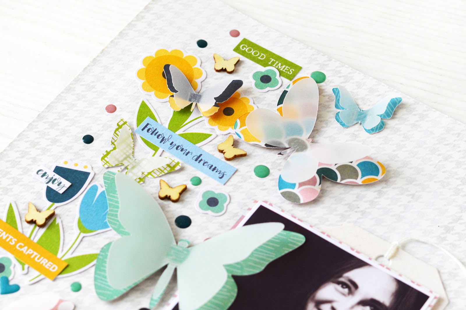
I chose different pattern papers for each one of the butterflies and cut them using my Silhouette Cameo. Then on Silhouette Studio I changed the size of them and made them a bit smaller and cut them, but this time on vellum paper. After that, I adhered a pattern paper one with a vellum one and created layered butterflies.
Here we can see how these butterflies turned out. I just loved the dimension and texture that these shapes added to my page.
Next up, I added more embellishments, the title, and my journaling.
Thank you so much for stopping by today! I hope you liked this idea on how to add a Silhouette Shape to a layout in a creative and fun way.
Jillibean Soup Supplies: Patterned Paper: Spoonful of Soul/ Gentle Soul, Free Spirit, Be Fearless, Choose Joy, Trust the Journey, Spoonful of Soul Bite Size Bits. | Pea Pod Parts: Spoonful of Soul. | Epoxy Stickers: Spoonful of Soul. | Foam Stickers: Spoonful of Soul. | Coordinating Stickers: Spoonful of Soul. | Washi Sheets: Spoonful of Soul. | Clear Stamps: Spoonful of Soul. | Tag: Lines. | Shaker Filler: Wood Veneer Butterfly | Silhouette Cut File: Jillibean Soup Spread your Wings and Fly #290212 | Other: Ranger inks, Glue, Foam Dots, Vellum, White Gesso.


I love your work. You did splendid job!
ReplyDelete----------------------------------------------
A day without a scrapbooking is a lost day. - Author Cestitka
Thank you!
DeleteOh my goodness, I love these pages! Not only the use of bright colors but the way you made everything 3-dimensional. I also like the additional of journaling.
ReplyDeleteThank you so much. I'm glad you liked! :)
DeleteAnother totally fabulous page, Maryam. I love the butterflies and the fun colors, but the picture and the journaling steal the show which is exactly what should happen - wonderful design. One of my favorite touches is the date stamp done twice - I may case that!
ReplyDeleteThank you so much! I'm glad you liked my project and yes, you should try the double stamped date ;)
Delete